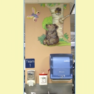
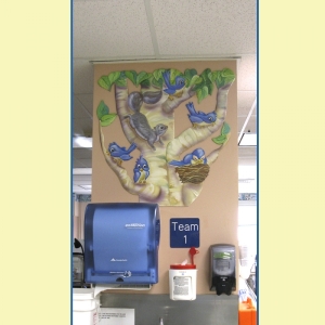
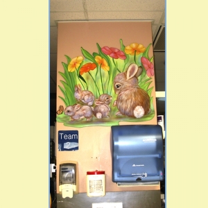
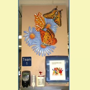
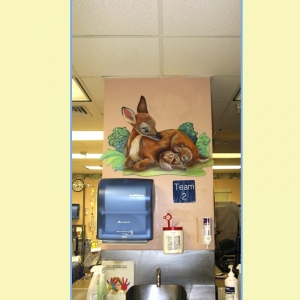
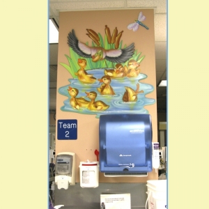
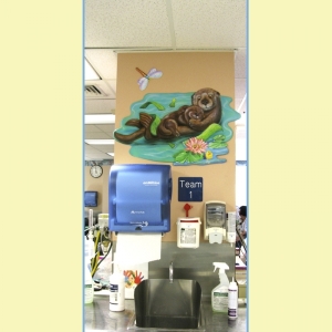
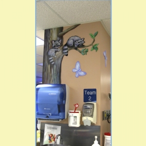
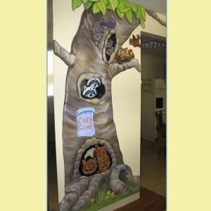
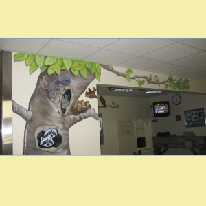
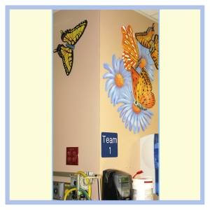
Mother and baby animals were suggested because of the same type of artwork on the outside of the unit. We created 2D cutouts of baby animals and birds to cover the columns next to each cubicle. This is a very cluttered unit with machines and monitors everywhere. So any artwork had to go up high. Using the top portion of the columns was the best idea for adding cute images. Everyone could easily see them. Mothers nursing for the first time could enjoy more of a nursery feel. This unit was so needing a facelift that these few images did wonders for it.

